The Height Distribution Curve
Written by: Julian Rane
If you've ever read the literature about Tall or nah's height calculator, you've seen the term "height distribution curve" at least once. It's often referenced in more technical breakdowns of height calculators and height statistics. But what exactly is a height distribution curve? And what role does it play in a height calculator?
The height distribution curve is the graphical representation of the statistical distribution of human height at different ages, most commonly from infancy to adulthood.
Male height distribution curve
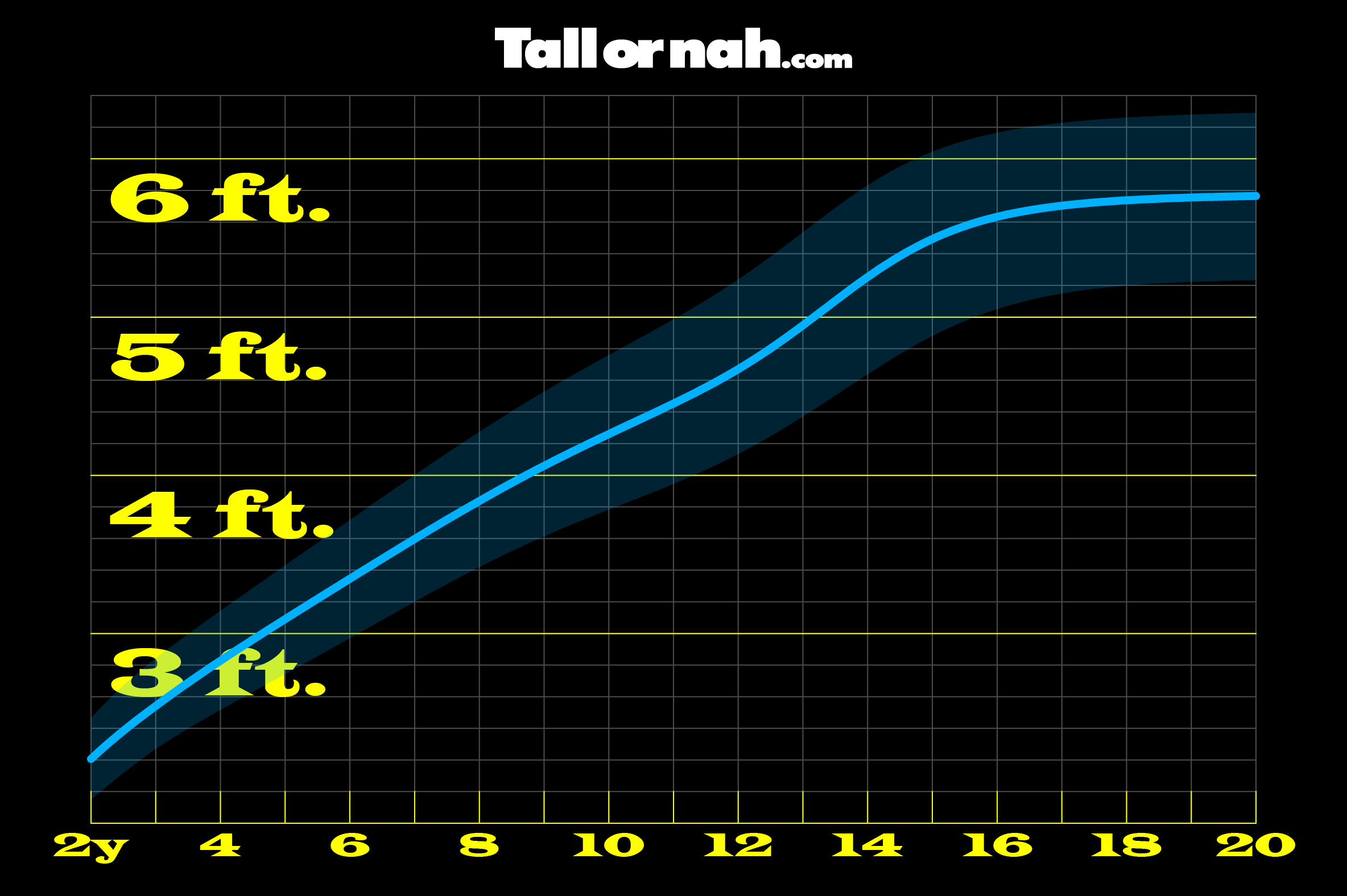
 Figure 1: Height distribution curve for biological males in the United States (source: National Center for Health Statistics)
Refer to Figure 1 for the height distribution curve for biological males in the United States. This graph charts the heights of biological males in the United States from the age of 2 to adulthood. Along the x-axis (going from left to right) is age, and along the y-axis (going from bottom to top) is height. Therefore, the curve begins in the bottom-left corner, when people are their youngest and shortest, and extends up and to the right to when people are their oldest and tallest. Each vertical line represents one year of age, and each horizontal line represents two inches of height.
The thin blue line that runs through the middle of the curve is the median—which I will explain later. The shaded region of the curve represents about 95% of the population, which means that only about 5% of biological males in the United States are above or below the shaded region.
Perhaps the most interesting aspect of the curve is its shape—it's most certainly not a normal half-parabola. The shape of this curve is the typical trajectory of human height increase. I specifically did not say of human growth, because there are many aspects to growth, of which height increase is one. Other areas of growth include changes in muscle mass, organ size, and bone density, all of which can be independent of changes in height.
Notice the path of the curve as one gets older. The steepest part of the curve is in the very beginning, between the ages of about 2 and 3, which represents the most rapid rate of growth in a person's life. The gap between tall and short is as narrow as it will ever be from here forward.
For the next 5 or so years, height increase will remain relatively linear for everyone, just at a slower rate than before. The next 5 or so years after that, from about the age of 8 to 13, is when the gap between tall and short will really begin to widen, as the shortest males will see their heights increase at a much slower rate than the tallest.
But they will all see a final burst in height from about the age of 13 to 15 before the curve begins to level off. This is the stage of life marked by the famous "growth spurt". Interestingly, however, this growth spurt is not as steep as it is during infancy—but it is much longer sustained, which is likely why it gets all of the attention.
After the age of about 15, height will continue to increase, but it will now be at its slowest rate ever. At this point, the gap between the tall and the short will more or less be defined, and the next 5 or so years will most likely be the last years of height increase, for anyone. Because it is at about the age of 20 when the tape measure can be put away, for males—at least until about middle age when most people will see their height steadily decrease.
Female height distribution curve
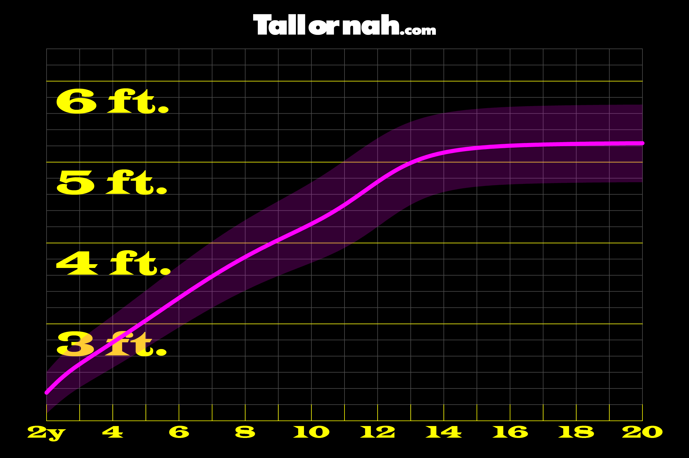
 Figure 2: Height distribution curve for biological females in the United States (source: National Center for Health Statistics)
Figure 2 is the same height distribution curve as Figure 1, but here the subjects are biological females. The general shape of the curve is the same, which means that the journey itself of height increase does not differ between the biological sexes. Where the major differences lie are in final height and the time it takes to get there.
The height distribution curve for females is, in effect, a compressed version of the male curve. Females reach their final heights much sooner than males do—by almost 4 years. This means that by about the age of 16, most females will have practically reached their maximum height. This also means that females will see their final growth spurt at around the age of 10, a few years earlier than males.
Unlike males, females can pretty much put away the tape measure when they start driving (which is usually at the age of 16), but not for good, because they too will eventually see a decrease in height, like males.
The median
Earlier, I mentioned the median line that runs through the middle of the curves. This line represents the 50th percentile, or the median of the group. That is, 50% of the subjects (biological males in the United States in Figure 1 and biological females in the United States in Figure 2) are above the line and 50% are below it. The further above the line someone is, the taller they are, and the further below the line someone is, the shorter they are. Therefore, in the most logical sense, everyone above the line is "tall", and everyone at or below the line isn't.
When the Tall or nah height calculator generates your percentage score, that number is more technically a percentile—the percentage of your peers you are taller than. And if your percentile is 50, then on the height distribution curve, you would be on the median line. And if you're on that line, then you aren't tall, in the most logical sense. Because tall must always be in the minority in every peer group, and the only way to ensure that is to define tall above the median in the event there are ties at the median.
The height distribution curve is the backbone of a height calculator. When a subject enters their information (height, age, and biological sex) into the calculator, that information is effectively translated into a data point and plotted on the appropriate height distribution curve. And the distance of that point away from the median—the line that represents the 50th percentile—determines the percentage of people the subject is taller than.
Remember, the curve itself represents the peer group. And so when your information is plotted on the curve, what's really taking place is a comparison of your information against everyone else's. And so if you're a relatively average height for your age and sex, then you are compared against a relatively large number of people, which makes the accuracy of your percentile relatively high.
The outliers
But what if your information isn't average? What if you're incredibly tall for your age and are in the "100th" percentile, for example? Technically, the highest theoretical percentile is just below 100, but for practical purposes, we can call this the virtual 100th percentile. This example here illustrates the biggest challenge in population-based statistics: the outlier.
To handle outliers gracefully, the height distribution curve is translated into a statistical formula that works everywhere along the curve, not just in the middle. And the most widely used method for this translation is called LMS, which stands for lambda (λ), mu (μ), and sigma (σ). These three parameters describe the skewness, median, and spread of the data, respectively. Using them, any height can be converted into its number of standard deviations away from the median (z-score), and then into a percentile, even if it's far from average.
With LMS, the curve itself doesn't have to be drawn out. Instead, its shape is captured in numbers using a parametric formula that defines the entire distribution mathematically. This allows percentiles to be calculated for any point on or near the curve, no matter how wavy the curve is, with remarkable accuracy—which is how the Tall or nah height calculator works.
It's easy to play with a silly height calculator, like Tall or nah, and not fully appreciate all that goes on behind the scenes. But behind every result is a mountain of research, a brilliant mathematical model, and a unique curve that tells the story of how humans grow. However tall you are, your percentile is more than just a number, it's your exact place on that story's curve. And if you ever find yourself in the "100th" percentile, you’re not just tall, you’re standing at the very edge of the curve where the math works its hardest just to keep up with you.